When Are You
Really an Adult?
Editorial Design, UI/UX
"When Are You Really an Adult" is an article by Julie Beck in which she explores the various standards of the word "adult" by adding diverse perspectives to it with nine interviewees. Inspired by this theme, I illustrated the concept with various color systems and theories and applied it throughout the book, web, mobile, and motion graphic.
PROJECT DURATION
Oct 2021 – Dec 2021
SOFTWARE
Photoshop
InDesign
Figma
After Effects
DELIVERABLES
Book
Website
Mobile web
Motion Graphic
Challenge
How might I work with a complex long-form text �and design a readable, engaging, navigable typographic interpretation of the text across four surfaces: mobile, desktop, print, and an “extension” piece?
Approach
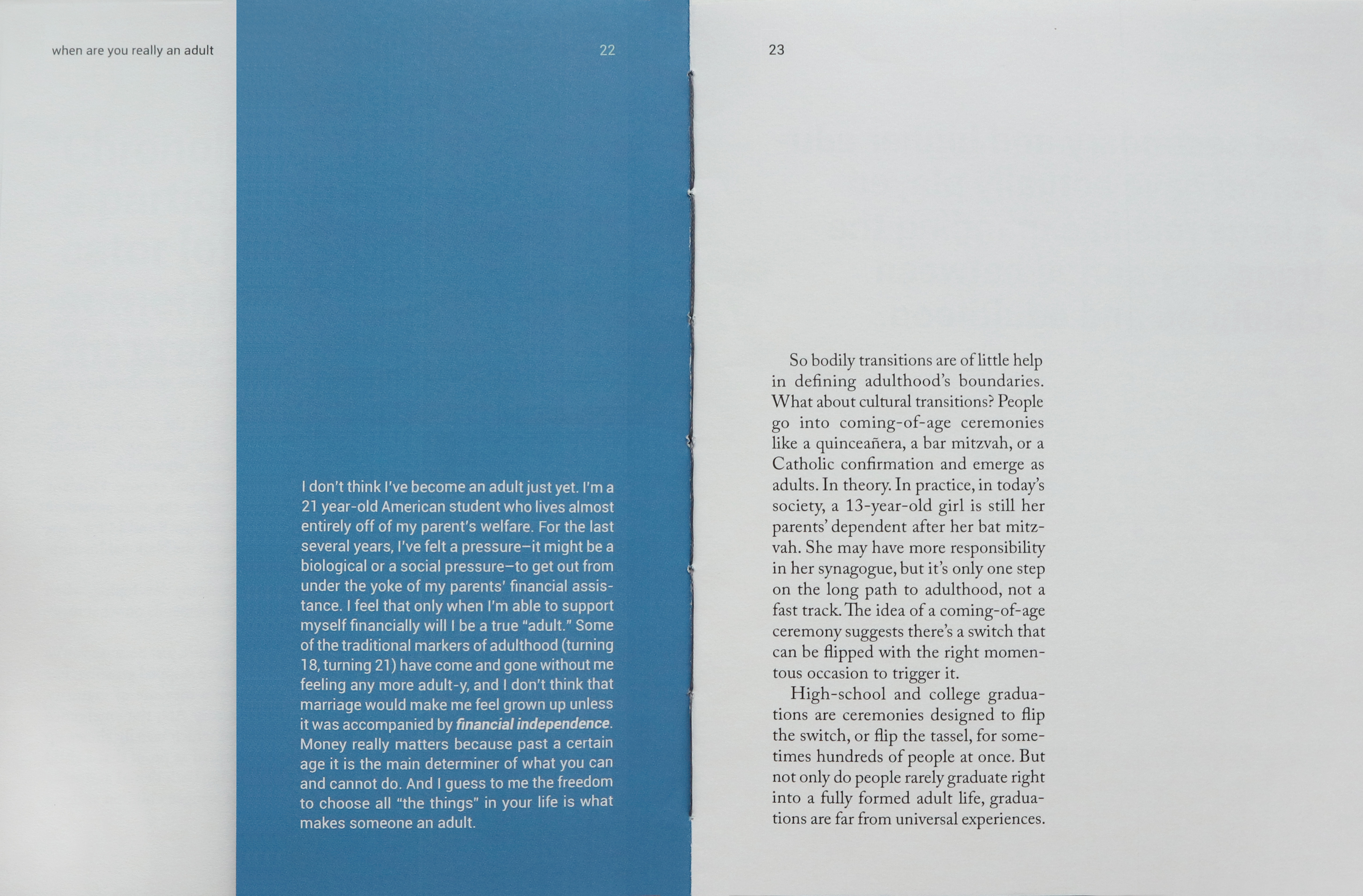
When people think of an adult, it’s usually related to age and physical development. However, this article offers an opposite view of the dictionary definition of what makes someone an adult.
Design System

I was inspired by the subject – various perspectives towards on one theme. First of all, I categorized interviewees by their main points: ambiguity, financial independence, self-worth, aggression, responsibility for a child, responsibility for parents, unconsciousness, death, and aging. Then, I researched color meanings and assigned appropriate colors to each interviewee. Therefore, I used another shade of gray to signify the neutrality of the author’s text as a primary color.
Book Design
.gif)
Book Cover

I believe that the cover of a book should grab people's attention in order to make them want to open it. Therefore, I designed a cover that shows the aging and its blurriness in the book. I placed a half face of a young adult with a blurry effect holding the frame on the cover, cut the inside of the frame, and placed another half face of an older adult on the second page to be shown through the cover. Readers can flip the cover to see the aging.
Binding
My book is 8.5 x 5.5 inches, which allows a great grip when flipping the cover. I sewed and made kettle stitch binding that shows the inner colors briefly.
Table of Contents
There are no chapters in the article, so I used the names of interviewees as the table of contents. I also intentionally cut about 1/3 of the interview pages in order for readers to see folio on the left side when they flip a page.
Web/Mobile Web Design
Web and mobile web versions are both one page. The web-version only has a navigation bar that contains interviewees' names as the table of contents. When users click each name, the website directly goes to the corresponding part. The layout is consistent throughout the media. On the web, a quotation is left-aligned, and body text is right-aligned for legibility and hierarchy. On mobile, all text is aligned left because of the screen size.
Website Version
(Click Here)
Website Navigation Bar

Mobile Web Version
(Click Here)
Motion Graphic Design
The last version is a motion graphic. I created a book trailer to show the aging transition and my whole concept of this project. I edited background music and considered drum beats to fit my storyboard. Unlike the other mediums, I set a black and white system in order for viewers to focus on my short trailer.


